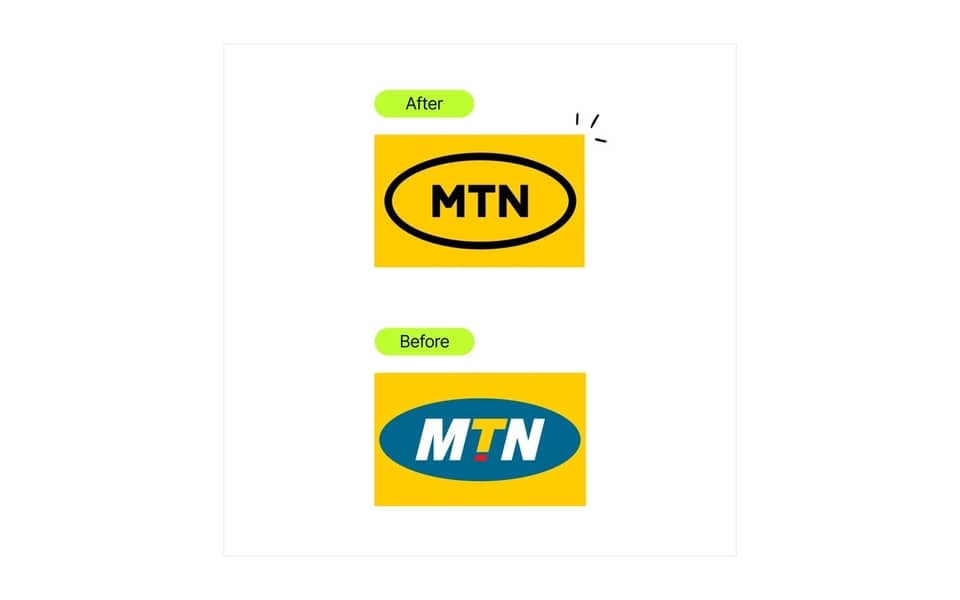
MTN, the worldwide telecoms firm, has unveiled a new logo ahead of an official brand update, which the company said is intended to signify the business’s transformation from a telecommunications to a technology company.
According to the company, the logo was updated because it has matured and needed to refresh its corporate identity to line with its strategic objective of providing digital solutions to aid Africa’s prosperity.
“Africa is a continent with enormous opportunities and energy, and MTN wants to play its part in harnessing its potential and progress through driving digital and financial inclusion.” the company wrote in a blog post.
What has changed in the MTN logo?
MTN believes very deeply in their distinctive assets, so their distinctive sunshine yellow color, mnemonic, and much-loved oval remained.

The new logo represents MTN as a digital citizen who is open to change, youthful at heart, inviting, digitally active, and progressive, according to MTN. There is no set date for when the deployment will be finished, but MTN intends to roll out the new identity on a replenishment cycle so that when old branding and branded objects are replaced, the new identity will emerge across our network.
The new brand identity is modern, simple, bold, and digitally dynamic.
Read: Mobile Money Charges 2022
The MTN Group is worth approximately $11 billion, with over 277 million subscribers in 20 African nations.


